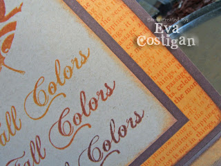
Being creative is truly fun and relaxing but there are so many possibilities out there that sometimes I forget about options and trying things in a new way.
I noticed Amy's last post and she mentioned new tricks to help make her photos pop.
I took 345 photos last weekend of Sam and Presley and used these same exact ideas of turning the camera or the photo when finishing up Presley's senior pictures.
Amy helped me have an "uh-duh" moment...why was I not doing the same thing on my cards?? And close ups are GREAT!
I am sure you will see some straight up shots again soon but I am liking this new...old way for now.
This card is an answer to this weeks Clean and Simple Stamping Blog Sketch.
Ink: Kaleidacolor Cappuccino Delight
Paper: SU! Close to Cocoa and More Mustard


3 comments:
Ooh, love the color gradation! Gorgeous.
Wow, beautiful card and love the colors... the ribbon through the big eyelet looks great too :)
Lovely card Eva. Great colors and images. :o)
Post a Comment